Smartsheet Mobile App
Usability Testing
January 3 - March 9, 2023
Team
Adrienne Lee
Kimberly Johnson
Veneza Yuzon
Zoe Zuo
Role
UX Researcher
Contributions
Conduct Heuristic evaluation of mobile app
Conducted usability testing
Took notes for other researchers during testing
Lead some of the meeting with stakeholder
Sponsor
Smartsheet product manager
Background
Smartsheet is a software program that allows user to collaborate, manage tasks, schedules, and documents. This was a class project for HCDE 517, Usability Studies.
Problem
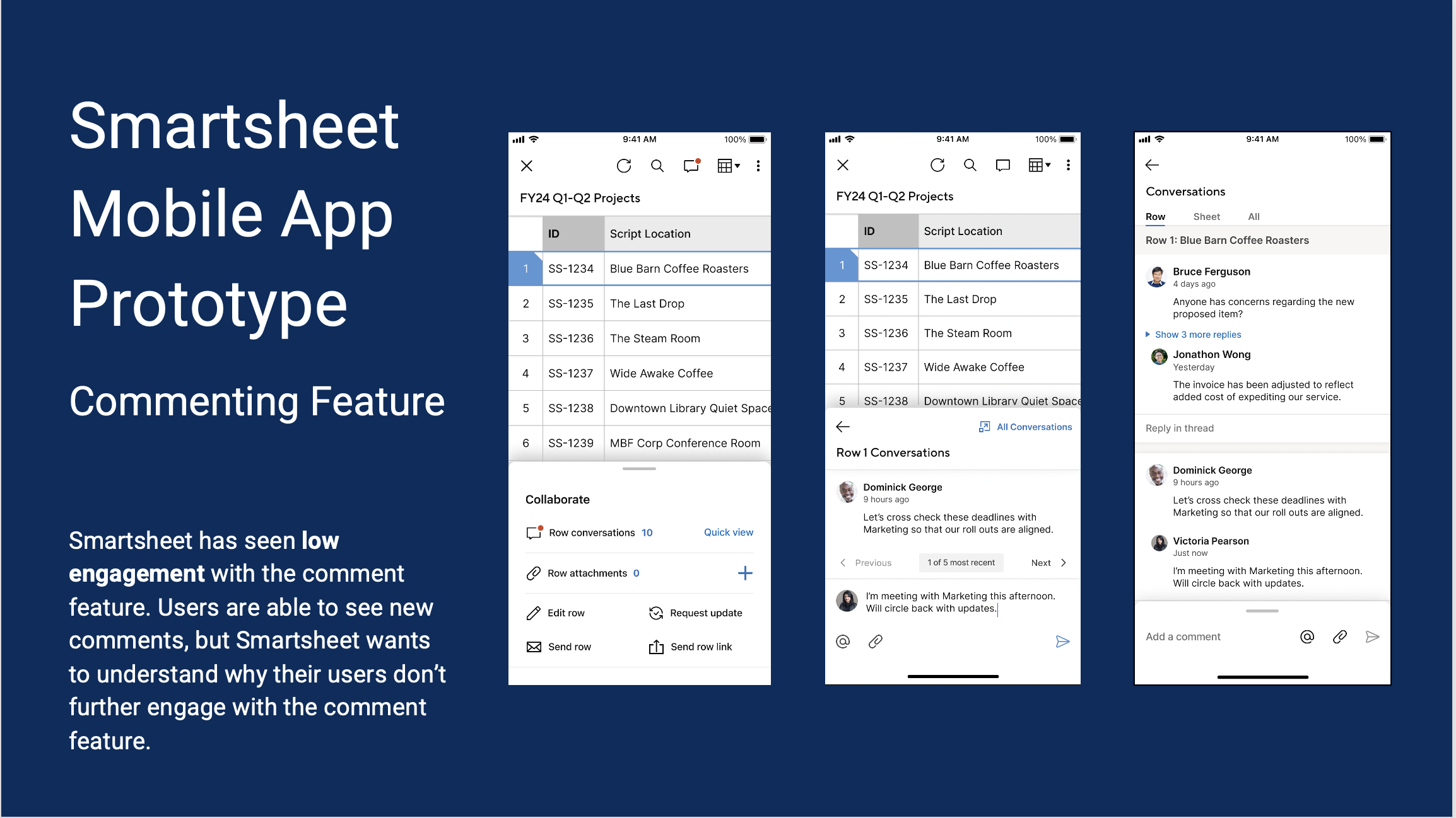
Smartsheet has seen low engagement with the comment feature. Users are able to see new comments, but Smartsheet wants to understand why their users don’t further engage with the comment feature.
Design Objectives
Design a visual brand for WSTL that clearly communicates its goals
Design a logo that sets it apart from the other Seattle based tool libraries
Design the mobile site for WSTL
Overview
Study Objective
Test current prototype to evaluate the updated commenting workflow
Research Goals
Understand if the updated prototype increase use of the commenting workflow in the Smartsheet mobile app
Understand the barriers and enablers to the commenting workflow in the mobile app
Participants
5 participants of various levels of experience with Smartsheet.
Method
Usability Testing
Moderated remotely over Zoom
Each participant worked through same set of tasks
Four tasks plus post-task questions
Participants
5 Participants
Working professional, age range 33-45
Varying levels of experience using Smartsheet product (experienced vs novice)
Task List
Reply to a new comment that was added to Row 1
Starting point: from the sheet view (i.e. Screen 1 in prototype)
Successful completion criteria: User knows how to open the notification from the QAT by clicking Row 1 or expanding the QAT, navigate to the Quick View,, reply to the comment, and submit the comment.Find and reply to a previous comment on the same row
Starting point: Quick View (ie. Screen 5 in prototype)
Successful completion criteria: navigates to “Full Conversations” from Quick View conversation, and replies to the comment from Bruce Ferguson by pressing “Reply in thread”.Probe on how a user would reply to a comment on another row
Starting point: Full Conversations
Successful completion criteria: N/A - just probing user[Optional, if time allows] Reply to a comment from a push notification
Starting point: from the push notification on prototype (ie. Screen 0 in prototype)
Successful completion criteria: User knows how to open the notification and navigate to the comment, reply to the comment, and submit the comment. User understands how to go back to the sheet from the comment page.
Task Metrics
Task-completion Rate (per task): Calculate number of participants that successfully completed a task vs total number of participants that attempted it.
Findings
Findings Summary
Participants want more context of the task & conversation when replying to a comment
Participants feel overwhelmed with navigating through lots of comments
People do not initially understand “Quick View”, but appreciate the function once understood
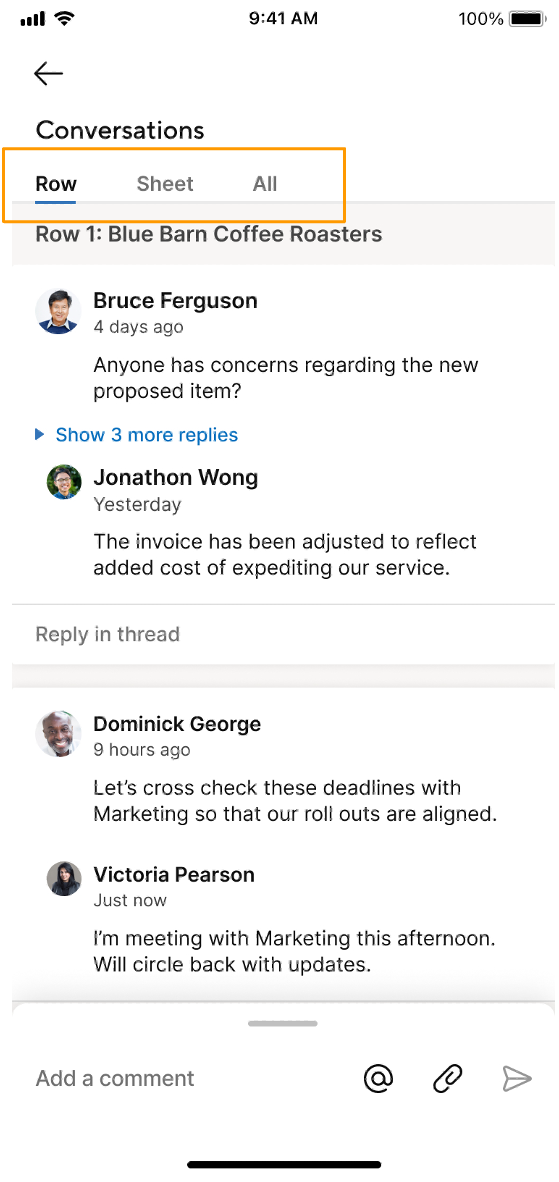
Participants have confusion about “All” vs “Sheet” tabs
Recommendations
Keep Quick View concept, but explore using clearer, more universal language
Add more organization to the Conversations View (e.g. filters)
Finding #1
Participants want more context of the conversation & task when replying to a comment
Severity: Catastrophic
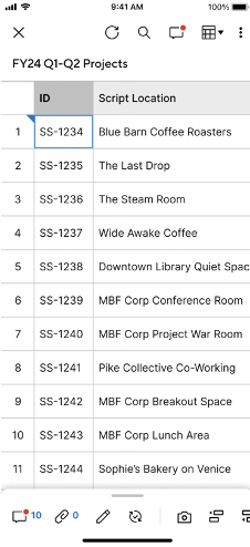
Description 1: On a mobile view, only a few columns are in view due to the limited space available on the screen.
Recommendation: Indicate that it is possible to scroll through the sheet from side to side in Quick View.
“It would be easier to make a kind of landscape to put those conversations maybe off to the right. And then you can kind of see what they say and then actively still look at the sheet” -P1
Severity: Catastrophic
Description 2: Participants felt that there was not enough information about the comment thread that would allow them to reply to a comment efficiently.
Recommendation: Be more clear about comment timelines and add more context such as conversation topic or project.
“If I’m in the app, I still have to figure out what conversation is coming from…it seems like it’d be easier if [as a team member] I know there will be no mistake on [the project I’m on].” -P2
Finding #2
Participants feel overwhelmed with navigating through lots of comments
Severity: Major
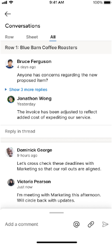
Description 1: 3 participants found scrolling through the “All” tab to look for comments was less efficient than going back to the sheet.
Recommendation 1: Make the information in the sheet related to the specific conversation come to the user, not have the user navigate to the information.
Description 2: Participants also wanted to find relevant comments more efficiently.
Recommendation 2: Make the information in the sheet related to the specific conversation come to the user, not have the user navigate to the information.
“I don't know the ones relevant to me. It's like kind of scary thinking like [if there was] a 100 things I have to like scroll through, or whatever it's like. Do I really want to get into this…” -P5
So if if it's my first time using it, I'll click all. But looking at this how it looks I'll probably go to sheet. [Because] if it's in Row 13 I'm lazy to scroll, so I'll probably go to sheet, and look for a Row 13.” -P4
There seems like there are a lot of conversations going on with all the projects. There should be an easier way for me to find; 1) the projects that I am part of and 2) if anybody @ me.” -P2
Finding #3
People do not initially understand “Quick View”, but appreciate the function once understood
Severity: Minor
Description 1: All participants were more drawn to the ‘10’ which indicated the amount of conversations on the row, or ‘Row Conversations’
Description 2: When asked, all participants were not able to initially infer correctly what the purpose of “quick view” was.
Description 3: People appreciate the function / purpose of the Quick view and the All Conversations once understood
Recommendations:
Keep the “Quick View” concept, but explore ways to simplify “All Conversations” and “Quick View” navigation, while only having one default navigation in order to eliminate confusion
For the “Quick View” screen, clarify type of conversation: are they all conversations on row? or recent? or unread?
“The red circle on it brought my attention there versus like reading everything on the screen. So it's the first thing I saw, and that seemed appropriate for what I was looking for.” - P3
“Quick view doesn’t seem super intuitive for that…’keep the spreadsheet over and see the comment’...still doesn’t seem super intuitive for it to be a quick view.” -P3
Finding #4
Confusion about “All” vs “Sheet” Tabs
Severity: Minor
Description : The Row, Sheet, and All tabs in the conversation panel was confusing to participants. The biggest confusion was understanding the difference between “All” and “Sheet” tabs and thinking that by selecting “All” the participant would see every comment they were part of and by selecting sheet it would take them back to the sheet.
Recommendation: Use clearer language to portray what goes into each category or remove the “All” tab to reduce confusion since users will already have an understanding of a row vs a sheet.
“My assumption is that when I click the all conversation that all conversations that I am part of.” -P2
“[Regarding Sheet view] I am not sure, I am assuming it is like an Excel spreadsheet, you just get assuming it is a list of all the projects.” -P2
Reflection
What Could Have Been Better
If we had more time, it would have been great to do generative research on the existing mobile app
It would have been nice to get some more experienced smartsheet users to gain that different perspective
An incentive may have helped participation
We could have improved the questions so they were more open ended
What Went Well
Appreciate the collaboration with the Smartsheet team
We were able to source participants within our own networks to meet the timeline
Piloting the interviews helped iron out kinks with the script and screen setup
Good organization upfront helped with note-taking
Predicting potential task flows helped us formulate the tasks and follow up questions


